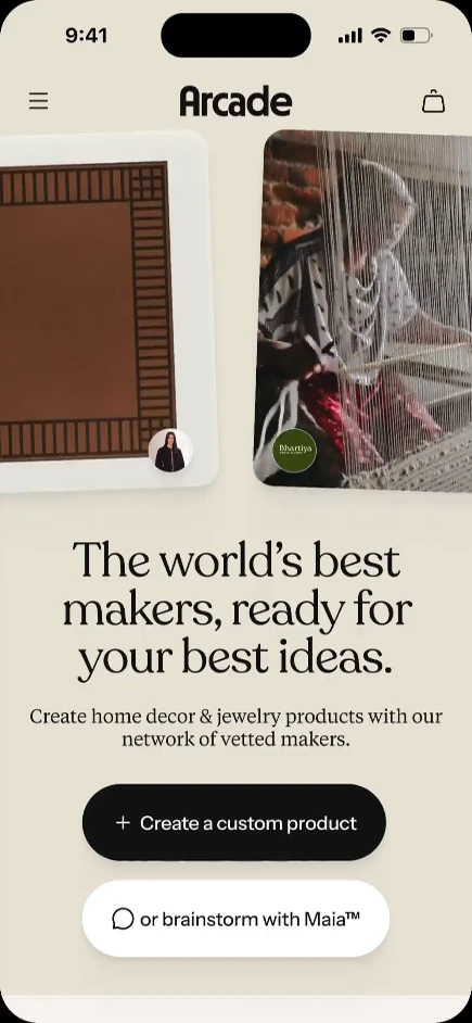
Arcade is the world's first AI product creation platform. Shoppers start by describing the colors, patterns, and materials they want in a range of jewelry and home decor products. Arcade then visualizes it for them, provides editing tools, and identifies an artisan who can be commissioned to bring the final vision to life.
Years
2025-2026
Role
Founding Designer
Platform
Web
As the Founding Designer, I was responsible for product design at an early stage consumer commerce startup, advocating product strategy, and running a user research cadence.
The top navigation bar floats (1) to maximize the visible area of content on each page, and (2) to reduce the visual weight of navigation, which already included a left-side rail.
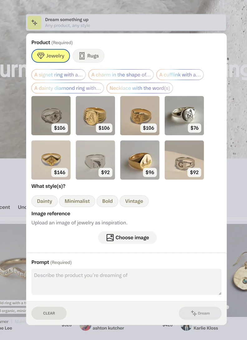
Color is an important descriptor when designing a product. The new Composer allowed people to pick specific colors from any reference photo.
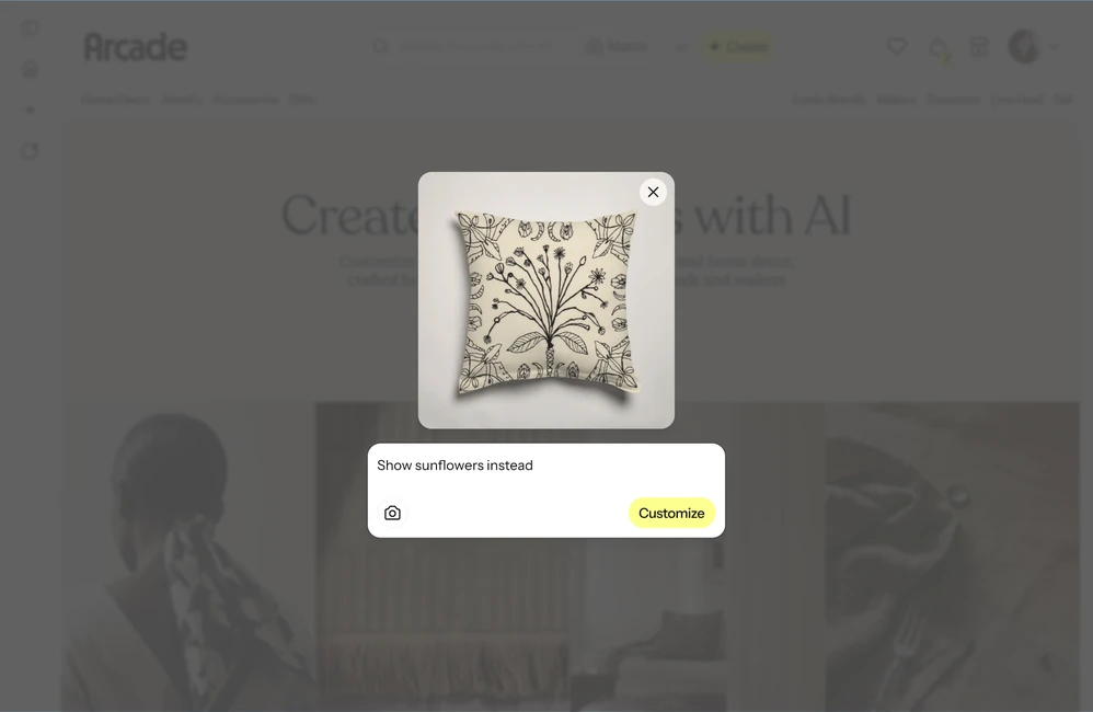
We encouraged shoppers to use any product on the Arcade marketplace as a starting point for their ideas. The "EDIT with AI" modal could be launched from any product card.
Arcade offers a more advanced editing tool, but we did not want to assume how you would want to engage; This modal hints at the types of input expected from each path.
SELECTED WORK
INSPIRE CREATION
Arcade is centered around the ability for the average person to design physical products, which made our “Composer” a very important point of friction.
When I joined the company, the composer presented itself as a freeform text input, but clicking into it revealed its true behavior was much closer to a traditional input form. The team had a desire to convey endless possibilities, but the platform had real constraints which were hidden from each user and led to issues further down the product creation funnel. Its shape was also irregular: a dropdown modal that could sometimes become long enough to require scrolling. It was packed with features that did not have enough room to explain themselves.
BEFORE
The previous Composer presented too many decisions for a visitor to make, and lost a clear next step.
AFTER
Giving the Composer full-screen real estate let us break out the creation flow into multiple steps, reducing decision fatigue.
The design lacked honesty and was causing confusion.
I've found it important, both from personal experience and from interviewing users of design tools, to expose the limits of what's possible. Showing the constraints actually gives people more trust and understanding of what they can try. We're more likely to try something if we know how it can be used.
The composer I designed became a full-screen experience, reflecting its importance, and is launched from a CTA explicitly labeled CREATE. It addresses the constraints of our product development capabilities by asking users to choose a specific product type before being granted a more flexible input experience.
Consider too: the average shopper does not know how to describe a design using the same terminology that a professional would. We added a catalog of design terms for them to pick from (with explanatory imagery to match), and a number of ways to select photos or colors as part of their design brief.
SELECTED WORK
ENCOURAGE ITERATION
When everything can be edited, what does a shopping page look like?
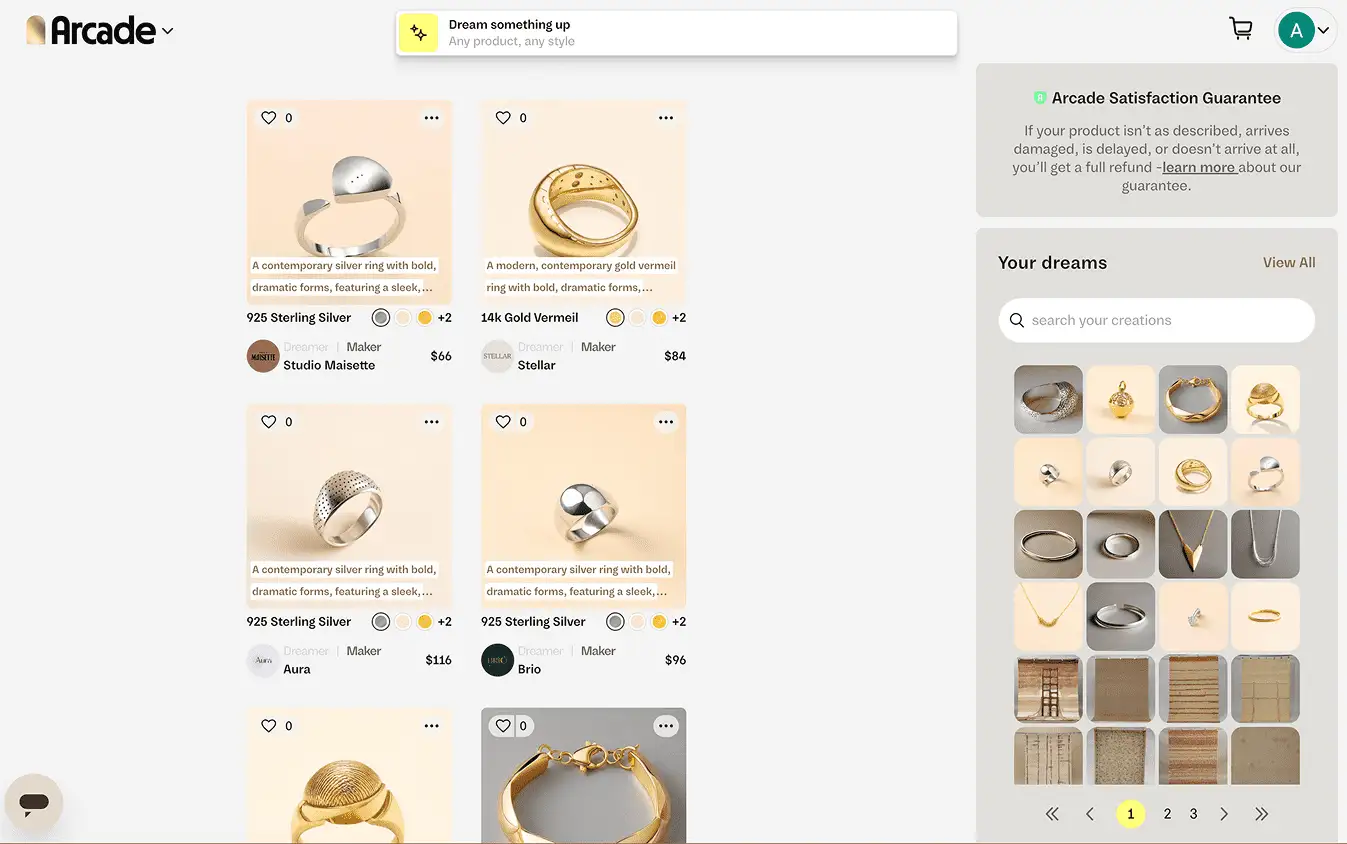
When the products a shopper sees are more likely to be of their own creation than belong to some curated collection, the form and function of a typical shopping results page must be questioned. Initially, after giving a design prompt to Arcade, the user was taken to the Results Page, but the page did not make clear what the results represented, nor what next steps the user could take. It gave too much weight to secondary features like the history of previous results. Without further effort, the shopper was left in a dead end. At this point, even with the extensive loading times (another point of friction), many folks we interviewed did not understand that the products shown were generated specifically for them, not off-the-shelf options.
BEFORE
The old results page failed to emphasize that results were generated, and gave too much weight to secondary features.
AFTER
The new design focused on squashing dead ends, but we were able to simplify product cards, clarify the CTAs, and increase image sizes.
The new results page had to solve a handful of problems, but the central theme needed to be presenting clear next steps, reducing dead ends.
My updated design gave several pathways of iterating on the initial set of designs, all funneled through a new agentic chat. The chat interface helped us make clear to the user what was happening during the loading state and emphasize the fact that the results being generated were one of a kind.
In addition to allowing a user to type a next step into the chat directly, we exposed prominent buttons on each product card which would clip that product design into the chat, allowing the user to reference the design in their next request.