 , I helped make the best tool for designing mobile apps, even better.
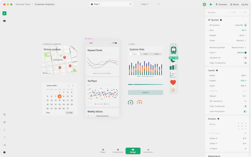
Play is the most powerful, realistic tool available for designing iOS applications. The materials you design with are more than just rectangles. Everything you introduce to your design is native—a real Apple map or tab bar, for example. When you're able to design with the same materials as a finished product, you design a better product.
As one of two product designers, I touched every step of the product development process.
I product managed the initiatives I designed, collaborating closely with engineers, QA, and leadership to see them through to release.
Aside from scoped work, I tested our applications, identifying flaws and documenting fixes. I developed content and documentation related to new releases, and supported research and interview efforts.
There were several key initiatives I led: Native Elements, Monetization, Code Export, and an unreleased but exciting new product...
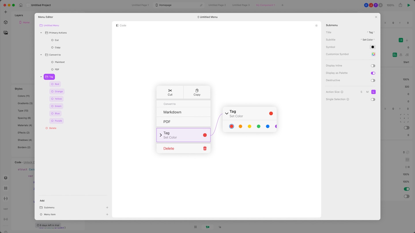
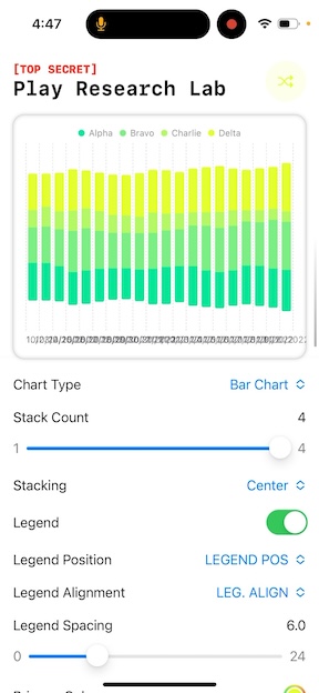
A core proposition of Play is to provide designers access to native "materials"—real iOS components and system capabilities. For example, a map you drag into your design is an actual interactive Apple map, not a static image. Adding more elements to the Play library was a priority, and I led the research, design, and testing for each addition: Gauge, Video, Z Stack, Spacer, Button, Camera, Chart, Tab Bar, Nav Bar, Menu, etc.
My research and design process started with building a prototype editing experience in SwiftUI. This allowed me to uncover undocumented behaviors and demonstrate how an element would react to changes within Play, before involving engineers.
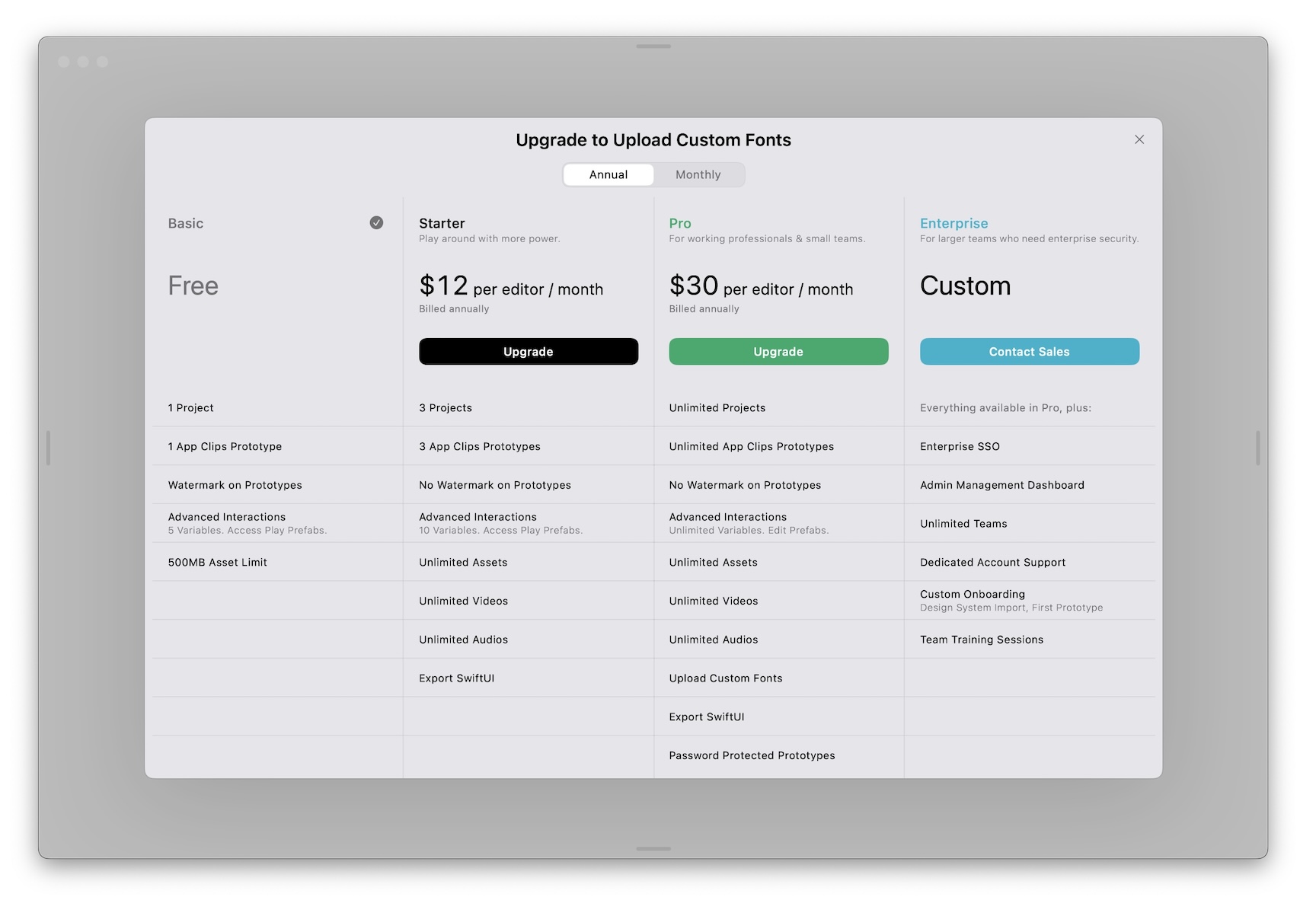
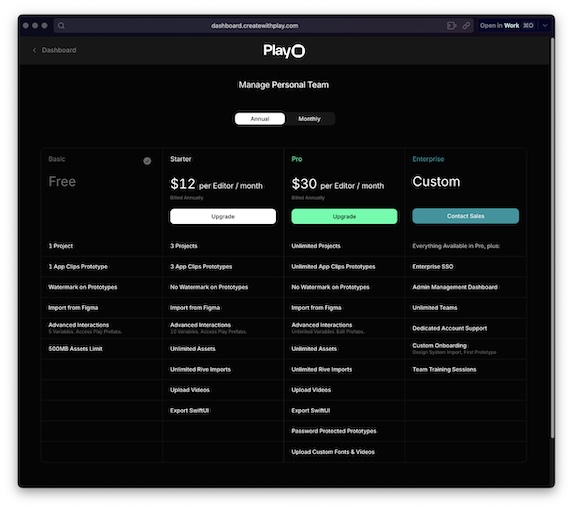
With the release of Play macOS, I led the monetization project and a coordinated release of an upgraded login interface and the introduction of Drafts. I designed all relevant payment screens and user flows across 3 platforms, project managed all development efforts, collaborated with QA, and researched Apple's payment guidelines intensely. Even after a successful release, monetization was an ongoing experiement.
Moving a product from design to code has traditionally been a very rigid transition. We identified the handoff from a designer to an engineer as one of the biggest pain points within product teams. We developed Code Export, a tool which converts any layout designed in Play to SwiftUI, in real time. Owing to my SwiftUI knowledge, I was product owner for Code Export, collaborating with engineers to improve code accuracy and more importantly, its readability.
To help users understand the potential of what could be created with Play, and to kickstart their design projects, we introduced the Explore tab. This tab featured projects intended to be educational, inspirational, or templates. The default category could contained a curated set of projects, while the "Learn Play" category contained all of our Starter projects. Other categories like "Navigation" contained helpful templates.
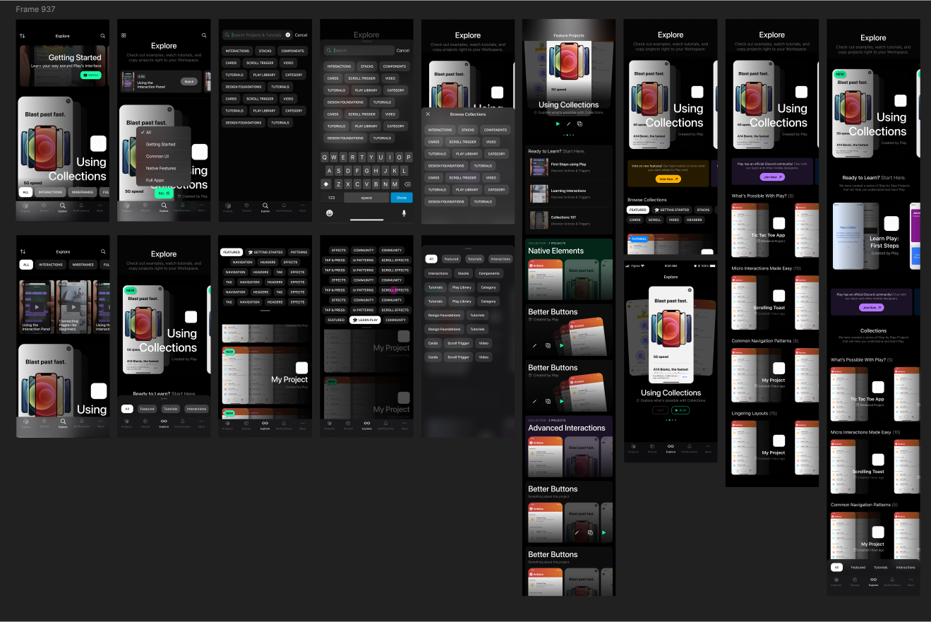
I'm quite proud of the animations and scrolling effects, but these were not just for show. They lend toward what I think is the most successful aspect of the final design: how efficient it is with space. The synchronized horizontal scroll effect of the category list meant we could fit in two rows, showing more to the user without needing to scroll.
When the user scrolls vertically, it's clear their intent is to browse the projects, so I felt comfortable diminishing the category list. However, if the user intends to switch categories at any point, they can tap, rather than scroll.