Logger
 is an app for tracking anything.
The app store is full of apps for tracking different things from workouts to medications, but if you have a unique thing to track, what do you use? I found myself in this scenario several years ago. After attempting to use Google sheets on my iPhone, I set to work designing a tracking app that would be completely customizable and user friendly.
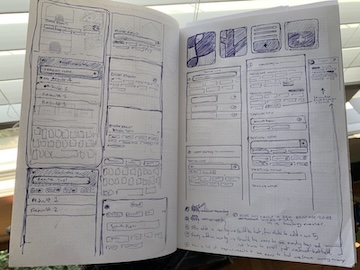
Working independently, I created Logger. I wore all of the hats: design, engineering, communicating with users, prioritizing bugs, copywriting, and marketing—all while learning SwiftUI and CoreData. I sought out an early set of users, growing a sizeable pool of beta testers from whom I collected valuable feedback.
As I built Logger, I shared progress on Twitter to attract potential users. Here's an example thread.
Why Build Logger?
Companies collect and analyze thousands of data points on our personal actions and habits every day. But if you wanted to do something similar, privately, your options are limited. Consumer apps mandate what data is important to track, and are inflexible to specific user needs. Spreadsheets are cumbersome, pen and paper is unorganized, and using several apps to track different things is a job on its own.
I wanted a way to log any sort of data quickly, on a mobile device, in a way that could be easily referenced, exported, and analyzed.
Challenges
Data entry concepts are unfamiliar to most people
To be approachable, Logger would have to cater to a population with different levels of technical savvy. How do I build a system that my mom could understand just as well as the self-tracking enthusiasts from r/QuantifiedSelf?
Handling flexibility
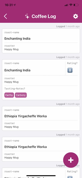
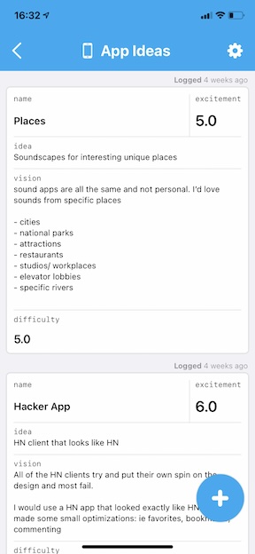
The types of information that can be captured are infinite: # of bedrooms, emotions, movie ratings, tasting notes, etc. Logger would need to display unknown data types in a format that felt custom designed to for each specific use case. How can diverse data be displayed in a way that's useful and not overwhelming?
Manual data entry is tedious
Anything that gets in the way of a customer entering their data is another reason for them to stop using the app. To help people form a tracking habit, Logger would have to be quick, simple, and enjoyable. How do I prevent someone from losing interest, or breaking a habit?
Solutions
The extended welcome
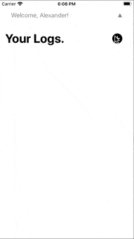
The welcome experience was designed to be helpful and inspiring. I consider onboarding to be the entire process of familiarizing someone with what a Log is and can do, beyond the introductory slides at first launch. I renamed technical jargon, iterated on copy throughout the app, and removed points of confusion that beta testers experienced.
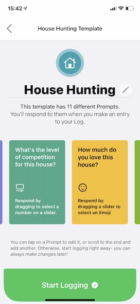
Instead of terms like forms, fields & inputs, I used language that did not lean technical: logs, prompts & responses (respectively). These words resonated strongly with a less technical audience (who compared logs to journals) and did not carry the connotation of data entry.
Presenting a variety of templates when starting a Log illustrates relatable use cases- helping to paint a picture of what’s possible without forcing people to think of something on the spot.

Interactions built for efficiency
Logger was built to be customizable. The ability to edit templates empowers the user to make the experience unique and tailored to their own life. That means only entering what matters, reducing unnecessary interactions. The Suggested Response and Remembered Response features significantly reduce the amount of typing, helping people make entries quickly.

Make sense of your data, with just a glance
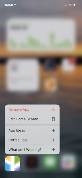
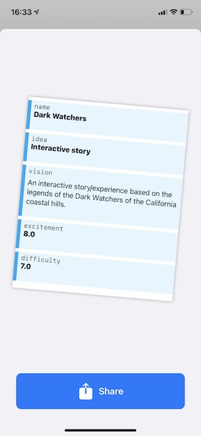
Using a card component, diverse data is displayed thoughtfully, helping users easily track while they scroll through many entries. The card layout dynamically adjusts based on the data available, keeping values in prominent positions so that your information is presented clearly.
Looking Back
Looking back on Logger several years later, there were some certain successes:
- Logger was very well recieved by users who had a use case in mind—I recieved several personal stories and many messages of appreciation.
- I was very efficient with smoothing out points of friction. I prioritized improvements with high impact, based on many conversations with beta testers.
Should I revive Logger in the future, there are several things I'd do differently.
- Focus on use-cases that deliver immediate value and help address existing problems in user’s lives, rather than solve novel use cases.
- Some users still did not understand the concept, so I would consider repositioning the app. Perhaps reframing Logger as a better mobile experience for spreadsheets. Or turning it into a a more powerful version of a journalling app, which most people understand.
- Even if users understood the concept of Logger, if they did not have a use case when the downloaded it, they did not develop one and quickly abandoning the app.
- Build CSV import and export. CSV users who may have to take notes / capture data in the field, might find it valuable to connect to Logger.
- Perform a visual overhaul. Having spent 3 years as a product designer since this project, there are a lot of improvements I would make to clean up the interface. There's too much text, niche settings are too visible, and there's a lot of spacing/type usage to be adjusted.