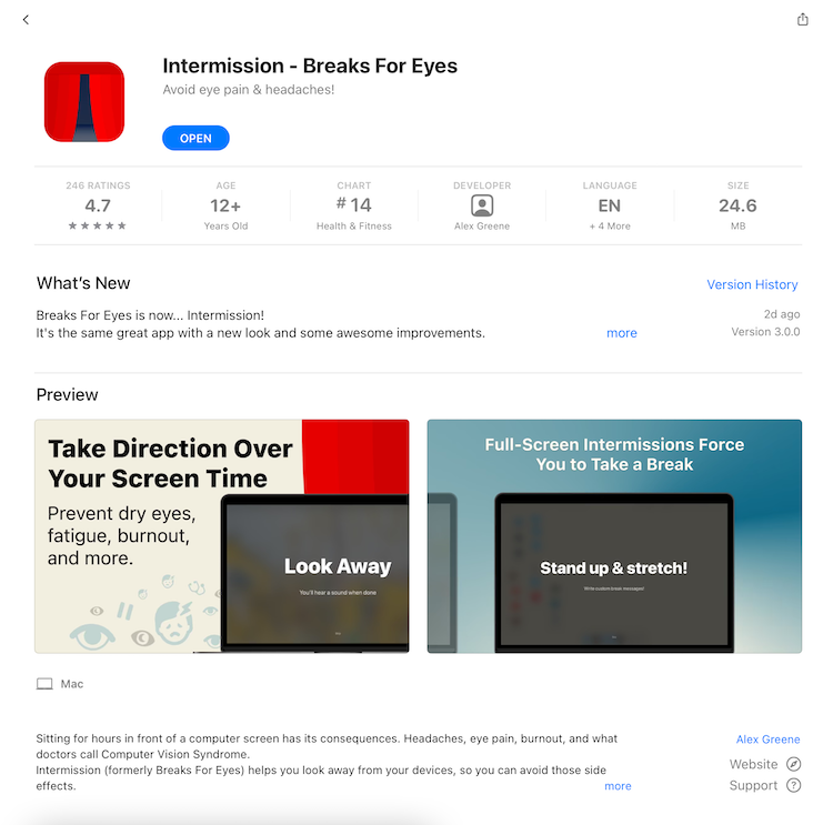
Intermission helps you look away from your devices, preventing sore eyes, burnout, and Computer Vision Syndrome.
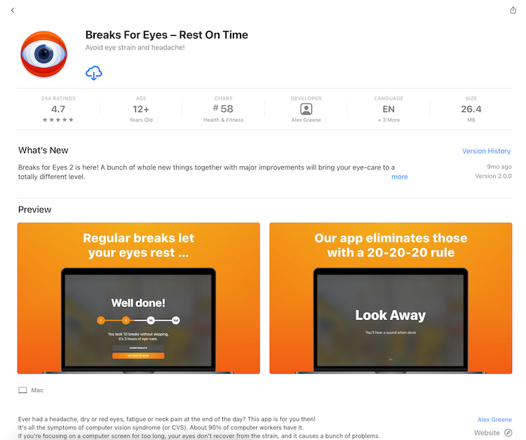
Breaks For Eyes was an app that blocked your screen at set intervals, and notified you to look away. After the original owner announced it was being shutdown, I was able to acquire it and rebrand it as Intermission.
Why Rebrand?
Breaks For Eyes was a highly rated application with consistent sales, but its branding and copy were intimidating and did not clearly communicate its value.
By rebranding to Intermission, I was able to introduce some personality to the app and make its App Store presence stand out amongst a sea of competition.
Challenges
While I had many ideas for improvements, I focused my attention on addressing these three core challenges.
#1 Lots of People Love It
Any changes I made might upset existing customers, who relied on Breaks For Eyes as part of their daily routine, especially if I were to introduce any bugs.
#2 Differentiating
There are many competitors. Breaks For Eyes did stand out with a bright orange color scheme and an big eye, but it also presented itself as somewhat intimidating, which is the exact opposite of the actual experience.
#3 Avoid Competing on Price or Features
There are many competitors that are less expensive or free, and many others that offer more features and customizations. Breaks For Eyes advantage was its simple & effective design.
Introducing... Intermission
The update introduced a new look and iterative improvements to functionality.
Playful Theme
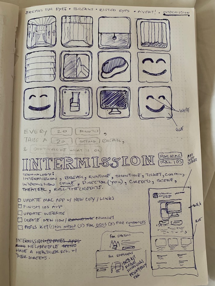
I decided on the name Intermission because of the many ways it related to the app, not just because it's a synonym for a break.
- A real intermission is a well deserved pause, when theater goers have time to rest and process after a long time in focus.
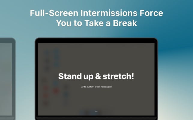
- One of the biggest selling points of the app is its use of full screen overlays, rather than just offering reminders. Real intermissions are very much required, and the curtains take over the stage in a way that Intermission takes over your screen.
- A theater is far less Orwellian, and more comfortable and inviting than an eye.
The result is a theme that's inviting and playful, while still presenting itself as a tool for digital health. The updated app icon is simple and inviting.
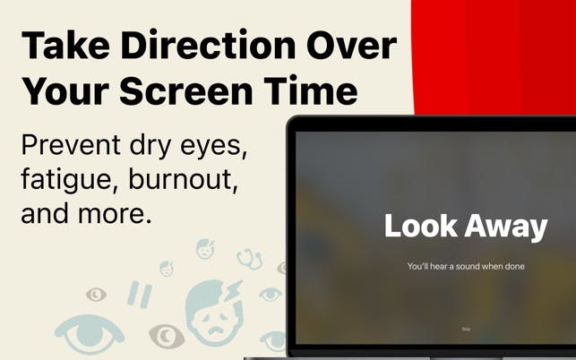
The App Store assets were redesigned to reflect the new color scheme and improved copy. The headline "Take Direction Over Your Screen Time" both ties into the theater theme and makes the customer feel empowered and proactive rather than remedial.
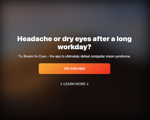
The new landing page presents the same message and leaves room for future related products, such as an upcoming iOS version of Intermission.
Built a new landing page for the @breaksforeyes rebrand. pic.twitter.com/PfN1S3YB0I
— Alexander Greene (@alexg473) April 6, 2021
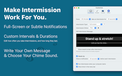
Uncomplicated Customizations
The features I've added bring value without unnecessarily complicating the user experience
- Customize how long breaks last and how often they occur
- Write your own message that is shown during the breaks
- Choose the sound that's played at the end of your break
Happy Customers, Improved Rankings
By minimizing the scope of the update as much as possible and focusing on improving simple features rather than adding complexity, no problems were introduced and customer feedback has been positive.
I was also able to address several poor reviews which have since been updated, and Intermission's ranking on the App Store has increased, both by Category (Health & Fitness), and by keyword ("Break Reminders", etc).